
The best homepages share a common formula: a clear message, a compelling visual hierarchy, and a focused call to action—and studying examples is the fastest way to learn it. In this article, we break down top homepage examples by business type and purpose, highlighting exactly what makes each one work.
Whether you’re building a lead generation page, an ecommerce storefront, or a personal brand site, you’ll find concrete design tricks, messaging strategies, and CTAs you can apply right away. Because while crafting the perfect homepage can feel like catching lightning in a bottle, the truth is there’s a proven playbook—and the best sites are already using it.
Key takeaways
- The most effective homepages have a clear goal and make the next step obvious within seconds.
- Strong above-the-fold messaging sets expectations and draws visitors in right away.
- Clear navigation, focused layouts, and strategic CTAs guide users toward action.
- Trust signals like testimonials, reviews, and social proof build credibility fast.
- Speed, mobile optimization, and consistent branding are essential for performance and conversions.
What are the Best Website Homepage Examples?
The best homepage examples are organized by business type and primary goal—because what works for an ecommerce store looks very different from what works for a portfolio or a service business.
As you plan your website, these examples can help you better understand the purpose of your own homepage and how to shape your design, messaging, and calls to action accordingly.
Homepage Examples for Lead Generation
A great lead generation homepage has one job: turn interested visitors into contactable leads. The best ones pair a compelling offer — a free guide, a trial, a consultation — with clear CTAs and just enough social proof to make saying yes feel like a no-brainer.
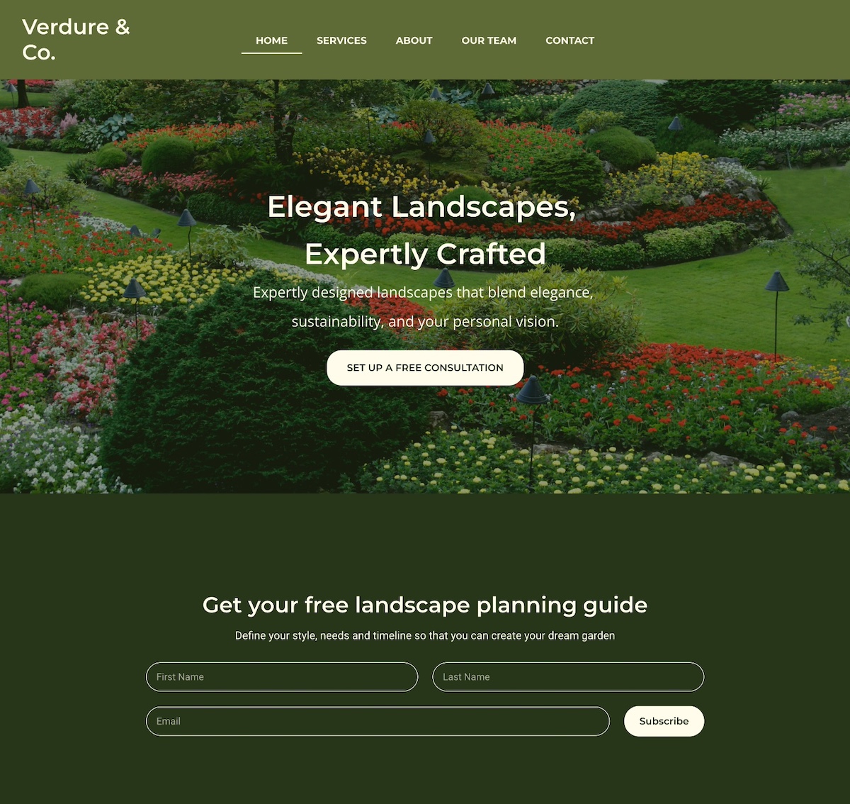
1. Notice that the homepage example below captures attention with an eye-catching photo that highlights their core message: expertly crafted landscapes. Worth noting, they prioritize email lead generation by offering a free planning guide right upfront. Offering a lead magnet allows them to attract interested leads and nurture them through strategic email marketing.
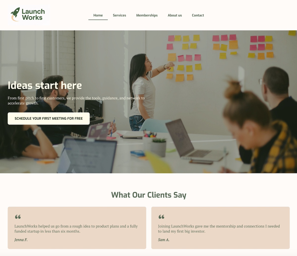
2. The below homepage stands out with a bold headline and subtitle that prominently highlight the business’s value and benefits. A clear call to action—which is action-based but also spotlights value (it’s free!)—is to the point and super effective. Then they follow their hero section with strong social proof via unmissable testimonials, adding credibility to their offerings.
3. The homepage below uses clear, compelling calls to action (CTAs) targeted at different stages of the marketing funnel. Visitors who are ready to make a decision can request a consultation, while those just beginning to explore can get started for free. By including these CTAs, they implement an effective lead generation tactic: to collect emails so the conversation can continue.
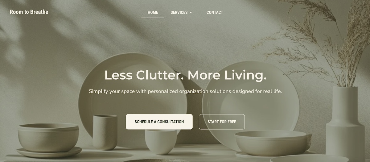
Pro tip: For all of these lead-generating homepage examples, it’s smart to segment leads based on which CTA they click. For instance, leads who choose “Schedule a consultation” can go into one list, while those who click “Start for free” go into another. This way, you can tailor your messaging more precisely based on where each lead is in the customer journey.
Want to make segmentation simple? SiteGround Email Marketing makes it easy to create targeted lists, send personalized emails, and track performance—all from your SiteGround dashboard. It’s a powerful way to nurture leads with the right message at the right time.
Get started with SiteGround Email Marketing >>
Homepage Examples for Ecommerce Stores
Ecommerce homepages need to do three things fast: show what you sell, make it easy to find, and give visitors a reason to stick around. The strongest examples balance eye-catching visuals with intuitive navigation and CTAs that move browsers toward buyers.
4. This site offers clear pathways to help customers find exactly what they’re looking for—whether it’s men’s or women’s items, new arrivals, or best sellers. The website navigation menu, header, and just below the hero section offer many ways for site visitors to find just the right next step.

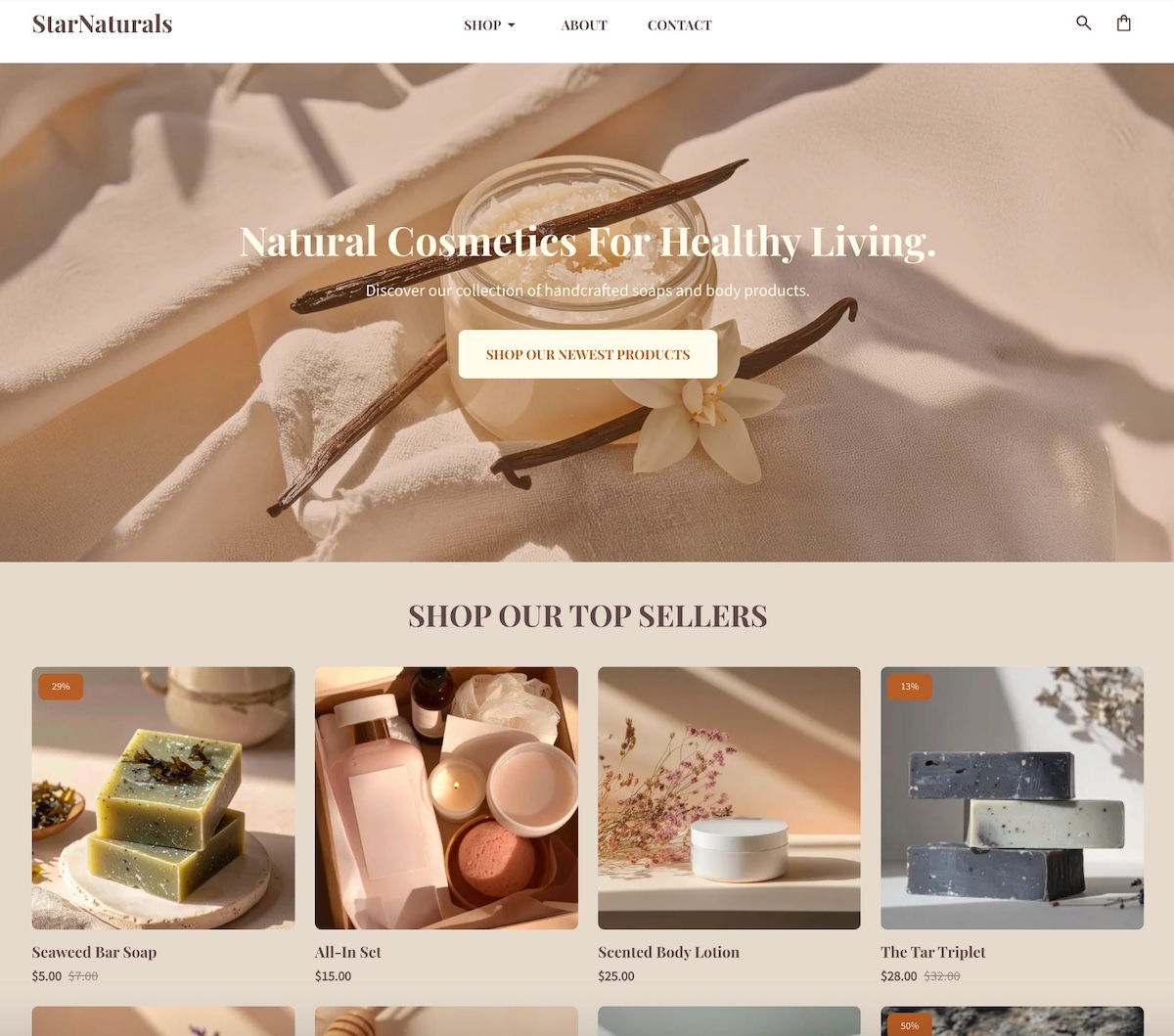
5. This site keeps it simple and effective with a single clean image and a clear and prominent call to action. More specific product links are neatly organized in the navigation menu under “shop” for easy browsing. Plus, in the post-hero section, they include a gallery of top products for instant ideas and shopping.
If you’re inspired by these ecommerce homepage examples and want to create something similar, SiteGround Ecommerce makes it easy to put these ideas into action. You can highlight featured products, added email marketing forms, and add conversion-focused calls to action—all while benefiting from fast performance, mobile optimization, and built-in security. The result is an ecommerce homepage that looks great, feels intuitive, and is designed to convert from the start.
Start building your ecommerce store now>>
Homepage Examples for Personal Websites & Portfolios
Personal homepages work best when they lead with personality before credentials. The most memorable ones use a strong photo, an authentic voice, and a clear invitation — whether that’s to explore your work, join your community, or get in touch.
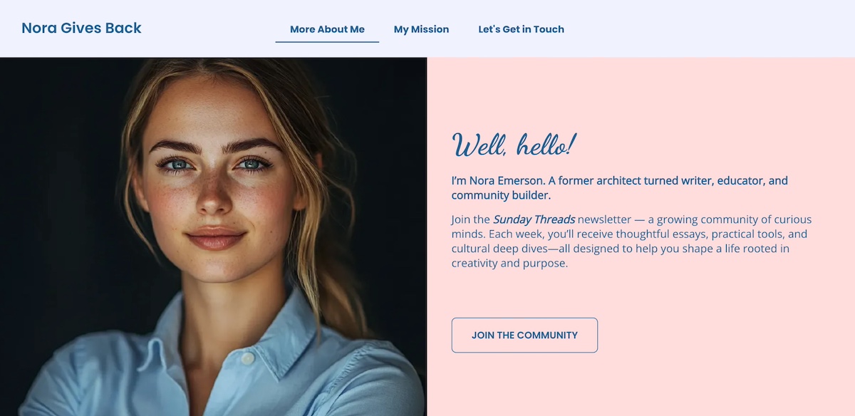
6. You’ll notice that personal webpages often take a slightly different approach. Impressive above-the-fold messaging and imagery is still important, but they’re focused more on personal photos and bios. This is evident on the homepage below, which features a friendly photo and heartfelt introduction that invites you to join her community and newsletter. The story and personal appeal make it hard not to want to “join the community.”
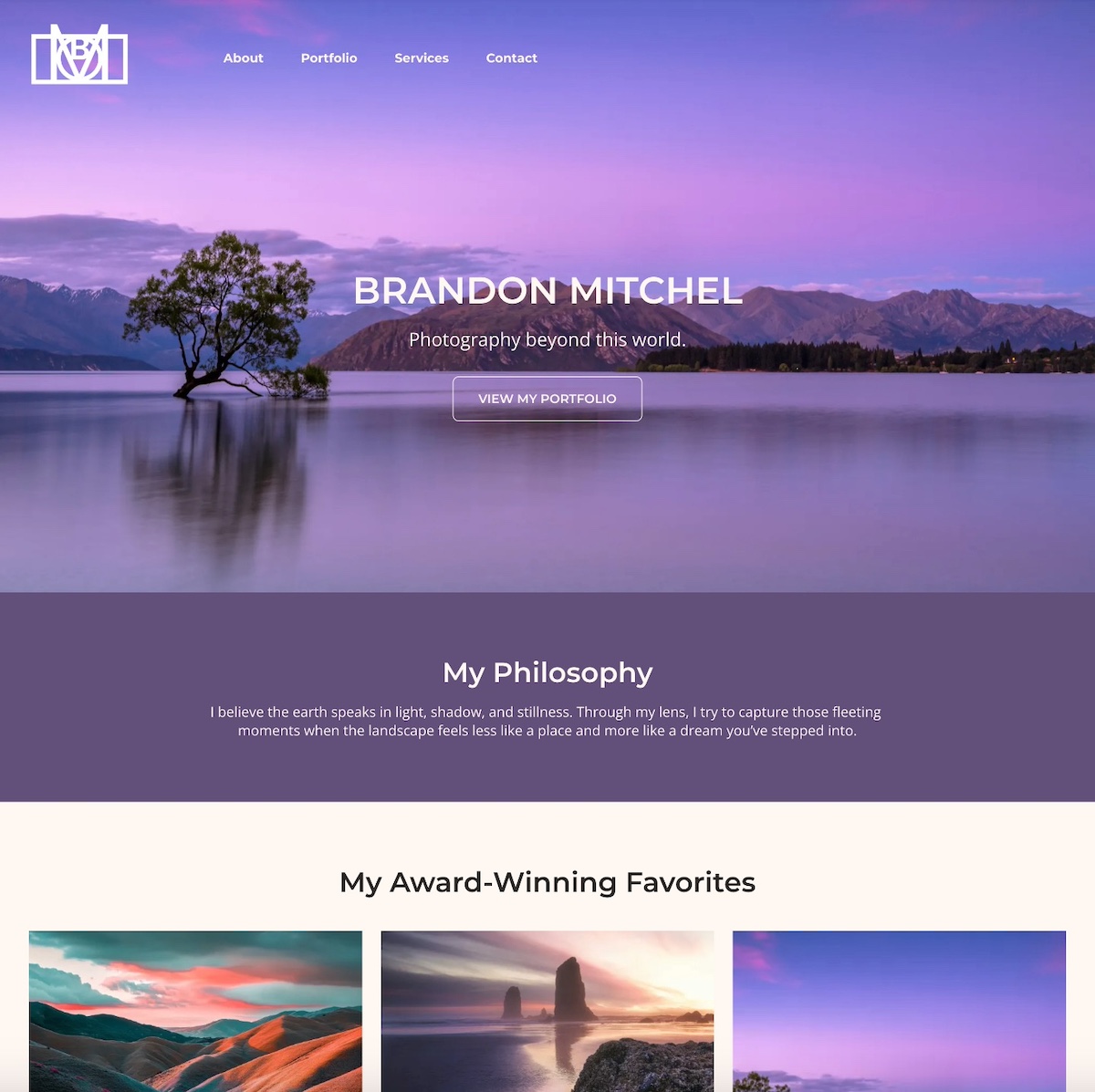
7. The below homepage example instantly pulls you in with its evocative hero image. It’s simple, captivating, and in just a few brief words captures what this site is all about: the ethereal photography. Below that, the photographer strengthens the message by sharing their personal philosophy, followed by a portfolio of imagery. The overall result is a quick and intriguing sense of what drives this person’s work, and what they have to offer.
Homepage Examples for Service-Based Businesses
Service business homepages need to answer two questions immediately: what do you do, and why should I trust you? The strongest examples combine a clear headline, an easy next step, and trust signals—like client logos or testimonials—that do the convincing before a visitor even scrolls.
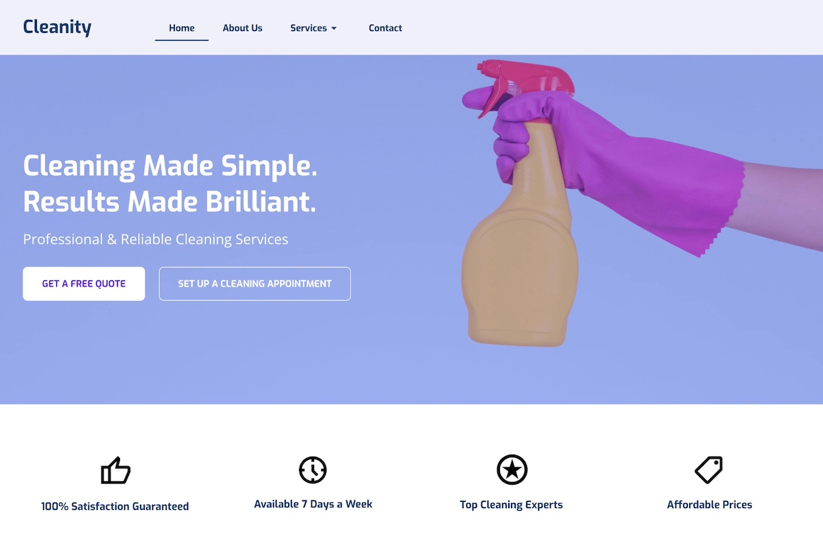
8. This homepage example stands out with a color-popping hero image and short-but-sweet headline that clearly communicate what the company does. And taking the next step is simple no matter where you are in the customer journey—you can either get a free quote, or jump right in and schedule. Below the hero section, they highlight key features that make their business worth using, helping visitors understand the brand’s true value.
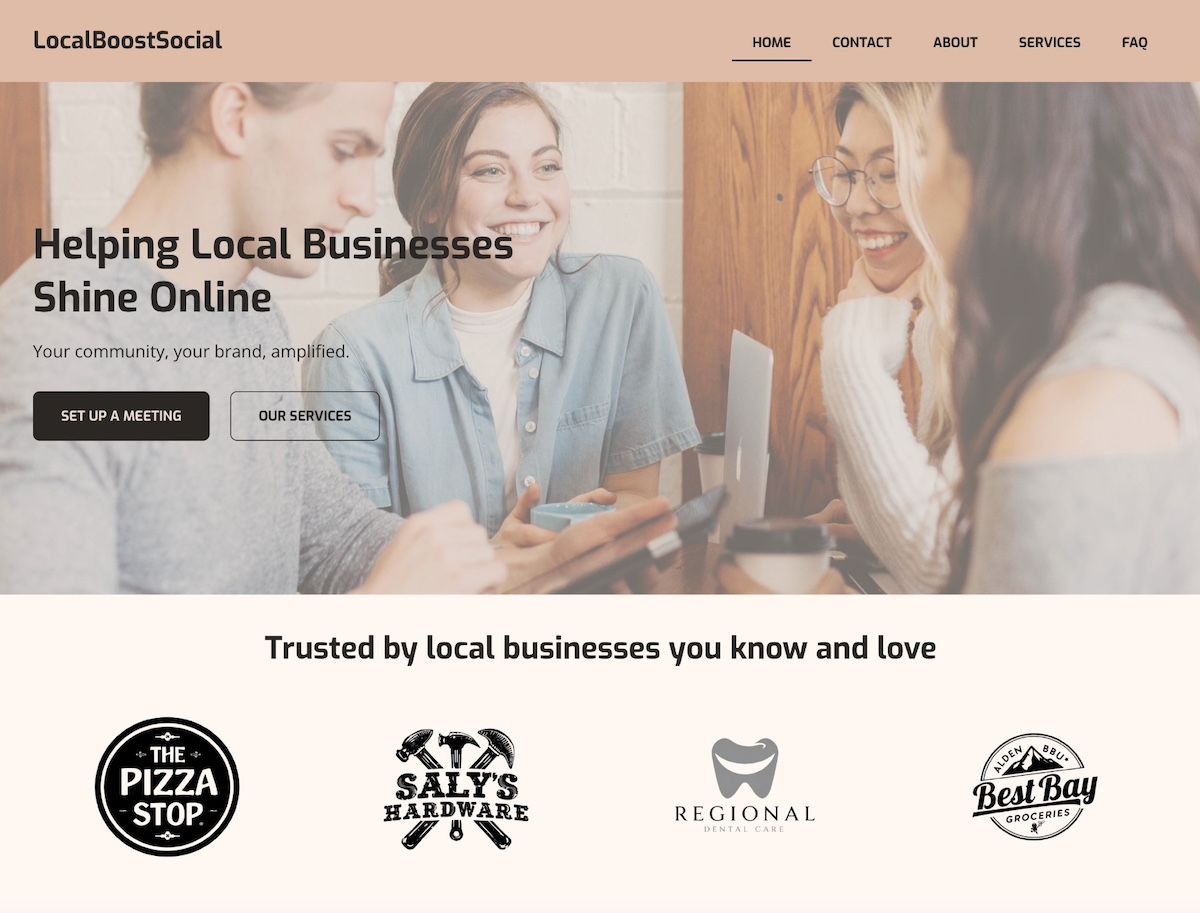
9. This homepage example opens with a friendly photo, intentional brand colors, a clear headline, and strong calls to action. Notably, because they focus on serving local businesses, the section below the header features client logos. This leverages the credibility and recognition of those businesses while strengthening their own brand—a form of social proof that’s especially powerful in a local community.
What Makes a Homepage Effective?
Effective homepage design comes down to a handful of core principles — no matter the business type or goal. Here’s what the best examples in this article have in common, and what you should keep in mind as you build your own.
Clear Purpose and Goal
Every great homepage starts with a clear objective. Whether it’s selling a product, collecting leads, or building credibility, your homepage should make its purpose obvious within seconds. Visitors should instantly understand what your business does and what action they’re expected to take.
Strong Above-the-Fold Content
The content users see before they scroll is crucial. Use this space to grab attention with a concise headline, value proposition, and a clear CTA. The data backs this up: Nielsen Norman Group eyetracking research found that content above the fold receives 57% of users’ total viewing time, with attention dropping off sharply below it.
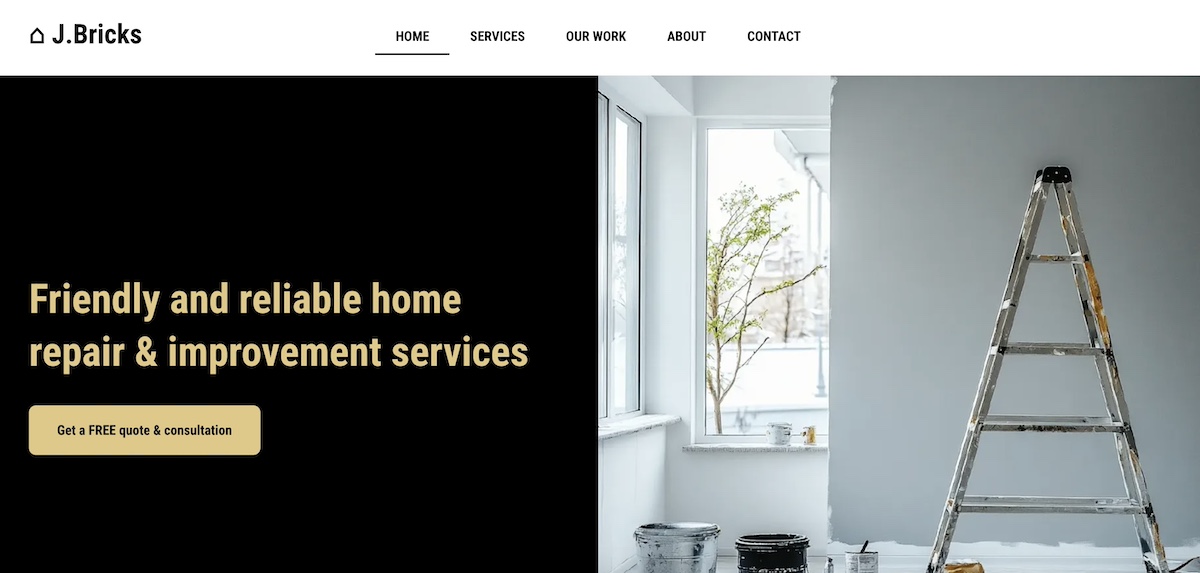
When it comes to effective above-the-fold design, the website below wins. It’s extremely basic and totally gets to the point with a straight forward value proposition, and a specific and enticing call to action.
Pro tip: many of these same techniques also form part of landing page best practices. It’s all about really nailing your hero section, value proposition, and CTAs.
Intuitive Design and Navigation
An important way to lower your bounce rate and keep users engaged is by creating a well-structured homepage that uses visual hierarchy to guide the eye and make content easy to scan. Keep navigation simple and predictable. Use clear headings, consistent spacing, and logical flow to help visitors find what they need quickly.
Clear and Compelling CTAs
Calls to action should stand out visually and align with your page’s goal. Use action-oriented language (“Get Started,” “Book a Demo,” “Shop Now”) and place CTAs strategically throughout the page to guide users toward conversion.
Trust Signals
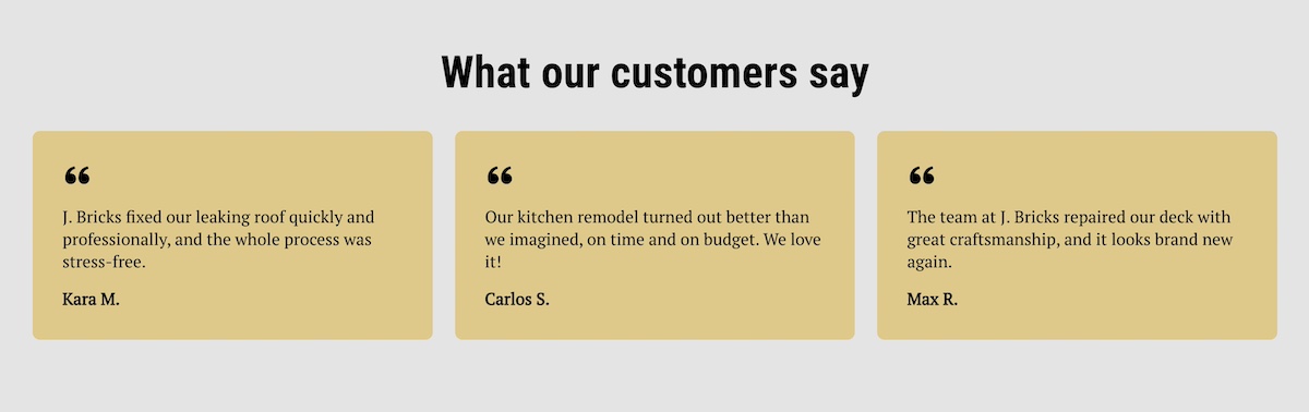
Build credibility with testimonials, reviews, partner logos, certifications, or guarantees. Even a simple “As seen in” bar or customer quote can go a long way in making new visitors feel confident in your brand.
Fast Loading
Page speed directly affects user experience and conversion rates. Optimize images, use clean code, and choose a reliable hosting provider to ensure your homepage loads quickly across all devices.
One of the easiest ways to improve page speed? Start with high-performance hosting. SiteGround’s infrastructure is built for speed, security, and reliability—plus, if you’re starting from scratch, the built-in SiteGround Website Builder along with SiteGround Ecommerce make it simple to design a sleek, homepage without sacrificing performance.
Get started with SiteGround now>>
Consistent Branding
Your homepage should reflect your brand basics—visually and verbally. Use consistent colors, fonts, tone of voice, and imagery to create a cohesive experience that feels trustworthy and professional.
Optimized for Mobile
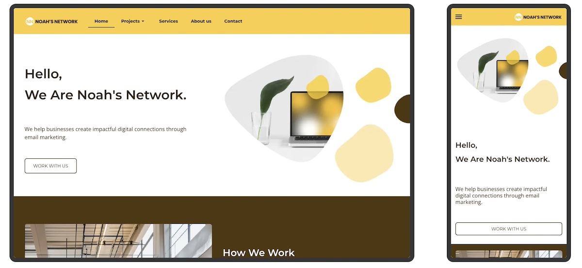
With more users browsing on mobile devices, a responsive, mobile-friendly web design isn’t optional. Make sure buttons are easy to tap, text is readable, and content stacks well on smaller screens without losing functionality.
With the SiteGround Website Builder, for example, we do this for you automatically. All websites are automatically optimized for mobile so that they not only look good, but work well.
[18]
Why Draw Inspiration from Homepage Examples?
Drawing inspiration from homepage examples is one of the fastest ways to improve your own. Real designs show you what works in practice—not just in theory—and help you make smarter decisions about layout, messaging, and calls to action before you start building. Here’s what to look for and what to keep in mind as you take notes for your own site:
- Clarify Your Page’s Purpose: Seeing how other websites define their goals—whether it’s driving sales, capturing leads, or sharing information—can help you pinpoint the main objective of your own homepage.
- Understand Best Practices: Homepage examples reveal how successful sites organize content, guide visitors, and encourage action—giving you a clearer sense of what works.
- Inspire Creative Ideas: A range of visual styles, messaging tones, and layouts can inspire you to find a look and feel that matches your brand identity.
- Save Time: Examples give you a starting point, helping you avoid design paralysis and focus your efforts more efficiently.
- Enhance User Experience: Learning from great design helps you create a homepage that’s intuitive, welcoming, and conversion-friendly.
- Define Your Website Layout: Different businesses require different website layouts. Understanding all of the above will help you determine what works best for your own webpage and to achieve your specific goals.
Before You Launch: Your Homepage Checklist
Building a homepage is one thing—making sure it’s ready to perform is another. Before you hit publish, run through these essentials:
- A clear headline that explains what you do and who you do it for, in plain language
- A value proposition that tells visitors why you and not someone else
- At least one strong CTA above the fold, with action-oriented language
- Intuitive navigation that makes it easy to find the next step
- A compelling hero image or visual that reinforces your message
- Social proof: at least one testimonial, client logo, or trust signal
- A mobile-friendly layout that looks and works just as well on a small screen
- Fast load time: test it before you launch, not after
- Consistent branding: fonts, colors, and tone that match the rest of your site
- A secondary CTA lower on the page for visitors who need more convincing before they act
If you can check every box, you’re not just ready to launch, you’re ready to convert.
From Homepage Examples to Action: Start Designing with Purpose
By now, you’ve seen just how much a great homepage can do—build trust, guide visitors, and drive real results. The best homepages aren’t the flashiest; they’re the clearest, most purposeful, and easiest to navigate. Whether your goal is to generate leads, make sales, or simply show off your work, let these examples be your creative fuel. Take what works, leave what doesn’t, and start shaping a homepage that feels like you—and gets the job done.
Not sure where to start? The SiteGround Website Builder makes it surprisingly easy to bring your homepage vision to life. With beautiful templates, design simplicity, and built-in speed and mobile optimization, it’s the shortcut to a professional-looking site—without the usual headaches. Plus, SiteGround Ecommerce makes it exceptionally easy to start selling online whenever you’re ready, so your site can grow alongside your ideas, goals, or business from day one.
FAQs About Homepage Examples
A homepage is the main page of a website—the first thing most visitors land on. A lead generation homepage, for example, might open with a bold headline, a free offer like a planning guide, and an email signup form. An ecommerce homepage might lead with a hero image, featured products, and a Shop Now button. The best homepage examples all share the same basics: a clear message, an obvious next step, and a design that reflects the brand.
Your homepage should have a strong hero section with a headline that explains what you do, a visual that reinforces it, and a clear call to action. Below that, include supporting content like key benefits, social proof, and easy navigation to help visitors find what they need. The exact look depends on your goal—a portfolio site feels different from an ecommerce store—but clarity and simplicity should drive every design decision.
A good homepage is one that matches your specific goal—whether that’s generating leads, selling products, or building credibility. Rather than chasing a single “best” design, focus on your business type and what your visitors need to see first: a compelling headline, a clear next step, and trust signals that make them feel confident. Start there, and build outward.
Most homepages follow a similar structure: a hero section at the top with a headline and CTA, followed by sections that build the case—benefits, featured products or services, testimonials, and a final call to action. The visual style varies widely by brand, but the underlying layout is usually consistent: important information up top, supporting detail below, and a clear path forward throughout.
At minimum, a homepage should include a clear headline, a unique selling proposition, at least one call to action, and basic website navigation. Most effective homepages also add social proof—like testimonials or client logos—along with a brief explanation of what the business does and who it’s for. Everything else depends on your goal and audience.
The headline. It’s the first thing visitors read and the deciding factor in whether they stay or leave. A strong homepage headline clearly communicates what you do and who you do it for—in as few words as possible. Everything else on the page supports and expands on that single message.
A homepage serves your entire audience—it introduces your brand, offers navigation, and points visitors toward different parts of your site. A landing page has one specific goal, like signing up for a free trial or downloading a guide, and deliberately removes navigation to keep visitors focused on a single action. Both need strong headlines and CTAs, but a landing page is narrower and more conversion-focused by design.
This article was originally published in September 2025, and then updated in April 2026.